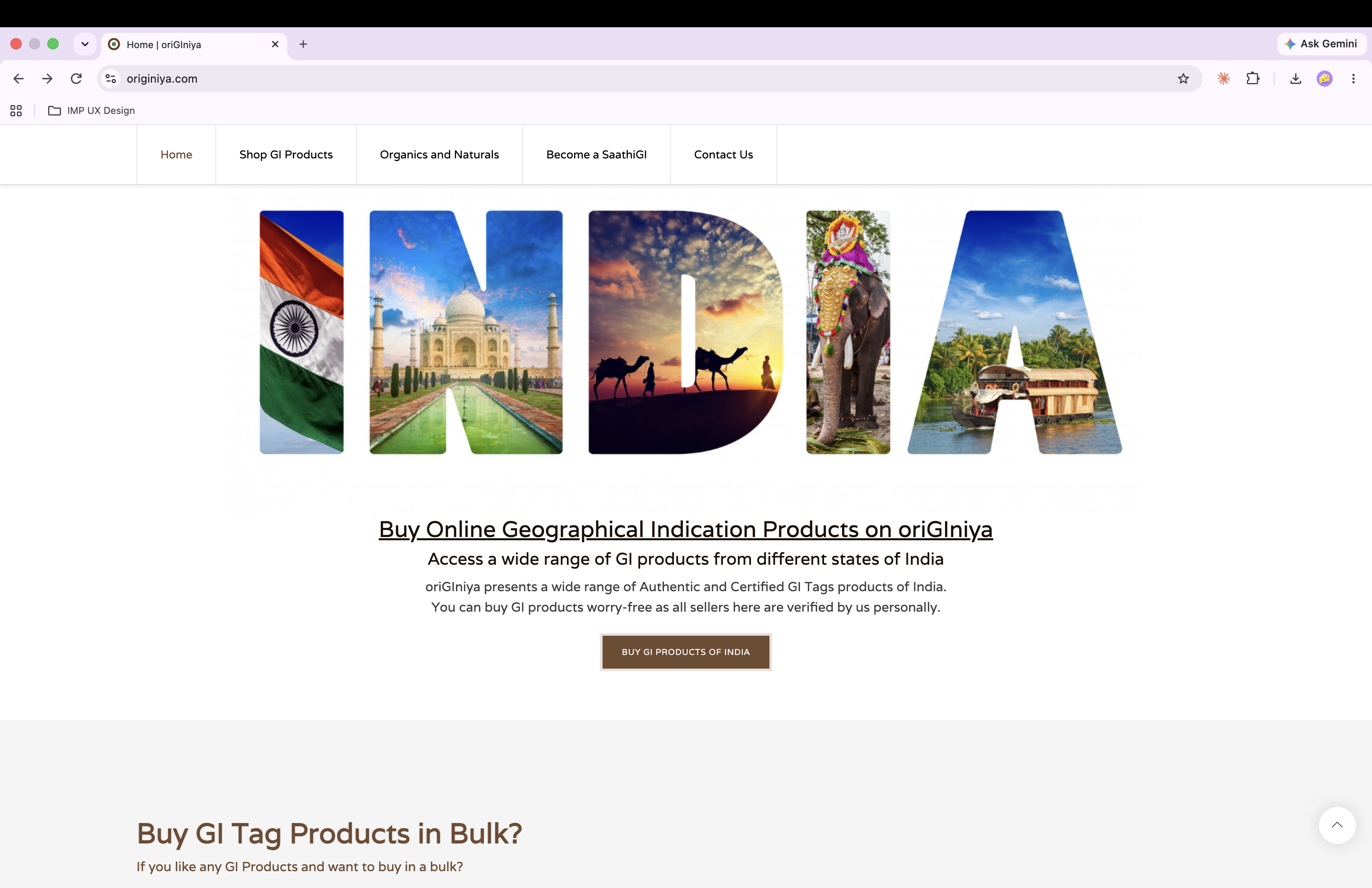
 + Add hero screenshot / homepage collage here
An end-to-end build: from subject research through UI design to ongoing product management, for an e-commerce platform selling India's GI-certified goods.
+ Add hero screenshot / homepage collage here
oriGIniya is an e-commerce platform built to sell India's Geographical Indication (GI)-certified products — agricultural goods, spices, and naturally wood-pressed oils — connecting indigenous farmers, artisans, and manufacturers to buyers across the country. Each product is listed with its official GI registration number, and the platform runs a partner program ("SaathiGI") for onboarding sellers.
Unlike the other case studies here, this one wasn't a UI pass on an existing product — you owned it end-to-end: research, design, and the ongoing job of managing products online. That full-lifecycle scope is worth stating plainly rather than undersold.
Business owners with a purpose but no online presence, GI-certified producers had no direct route to national buyers, trust/authenticity was hard to establish online for lesser-known regional products.
Needs to trust that a product is authentically GI-certified, understand what makes it special, and buy confidently — likely unfamiliar with GI tagging as a concept.
An indigenous farmer, artisan, or manufacturer who needs a simple path to list products and reach buyers outside their local market.
Analysis of competitor GI/heritage-product platforms, interviews with business owners, and offline store visits. Conducted market research on GI products in India, simplified product categories for online users, and organized them by state for better visibility and ease of use.
Defined the site's information architecture: Shop, GI No./GI Product browsing, Become a SaathiGI, category pages.
Designed the product page using Odoo's Produt Module to foreground the GI number and authenticity story, not just price.
Designed the SaathiGI onboarding/registration flow for non-technical sellers.
Set up ongoing product listing/catalog management workflow.
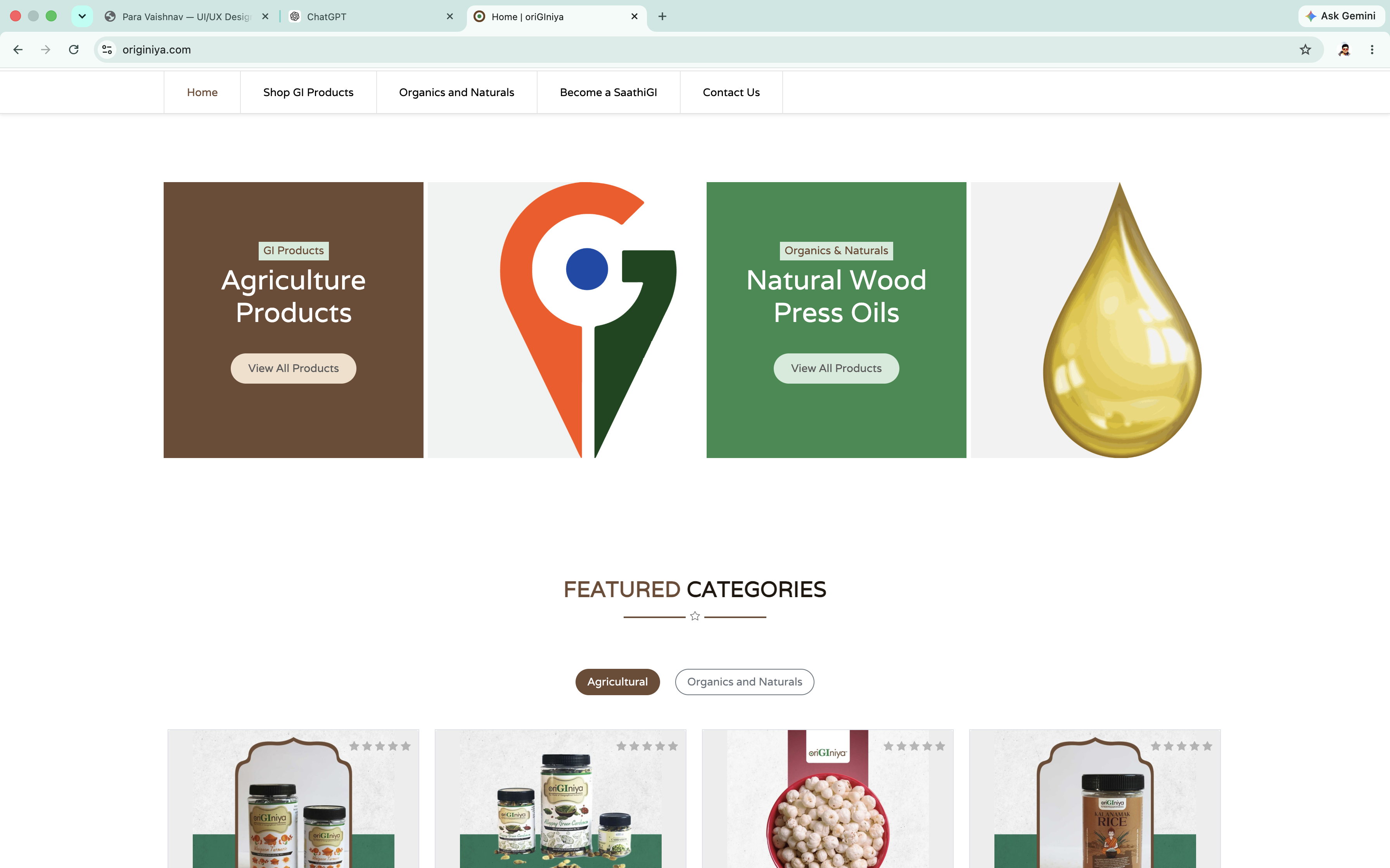 Homepage
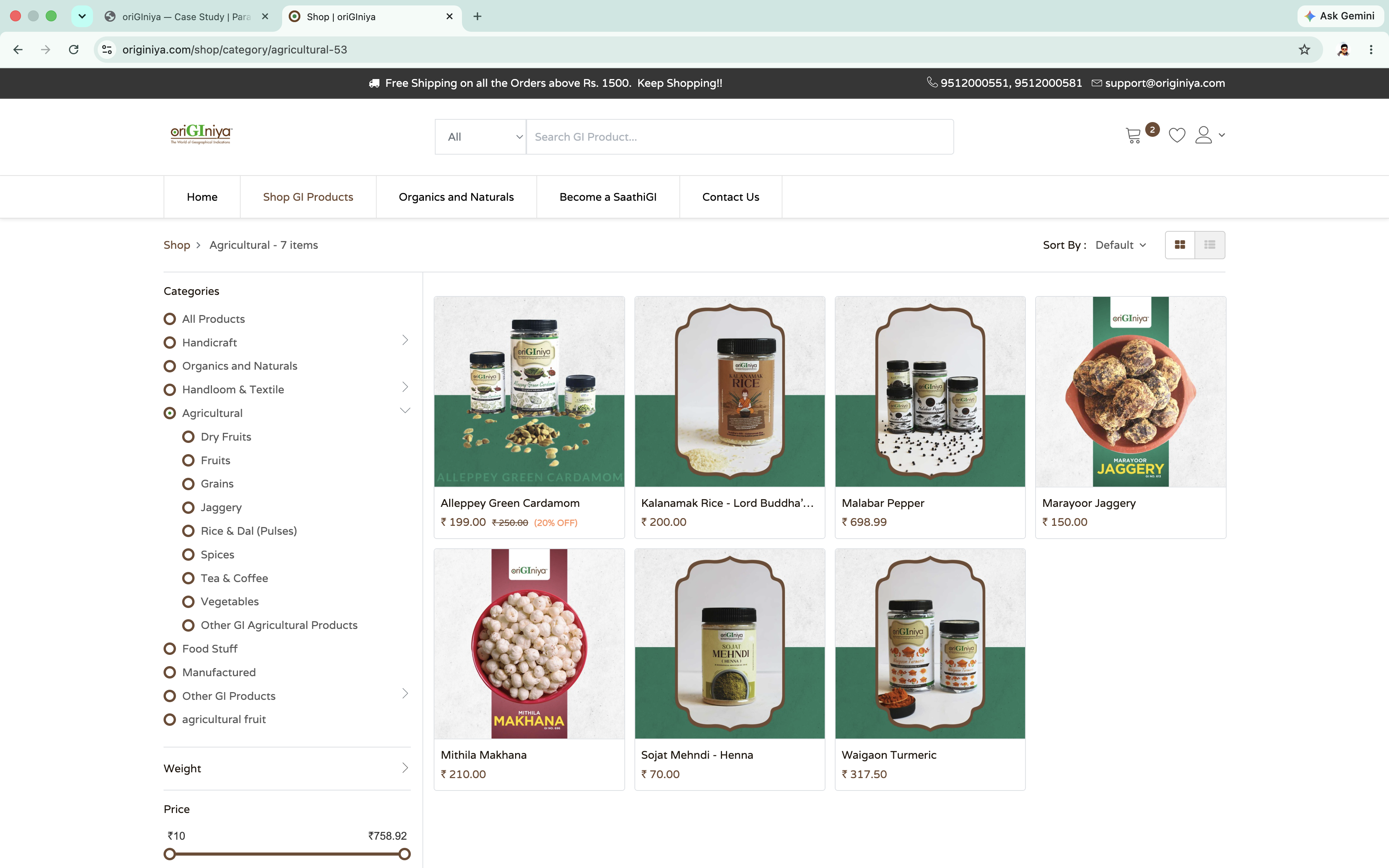 Category / shop page
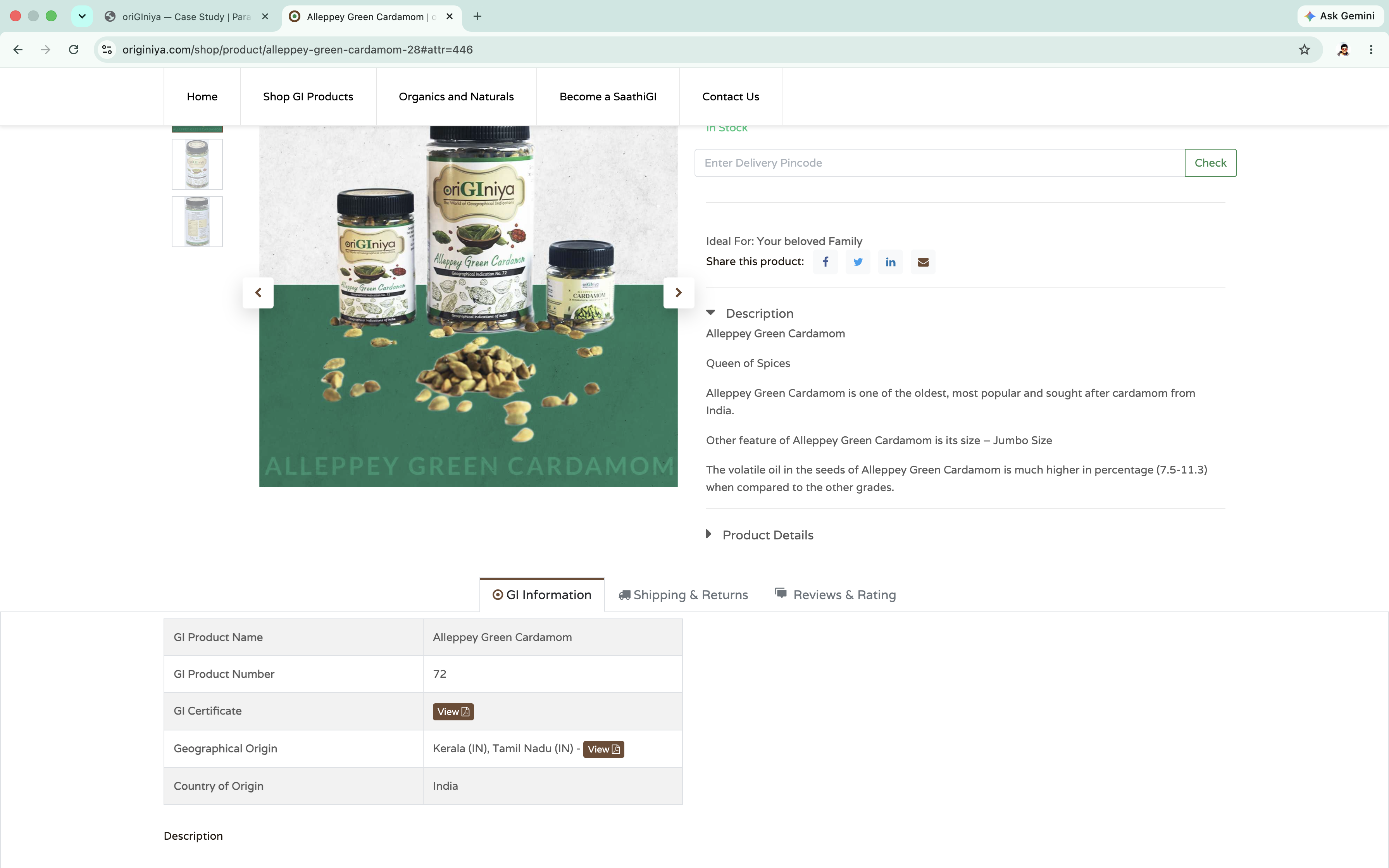 Product detail (GI No.)
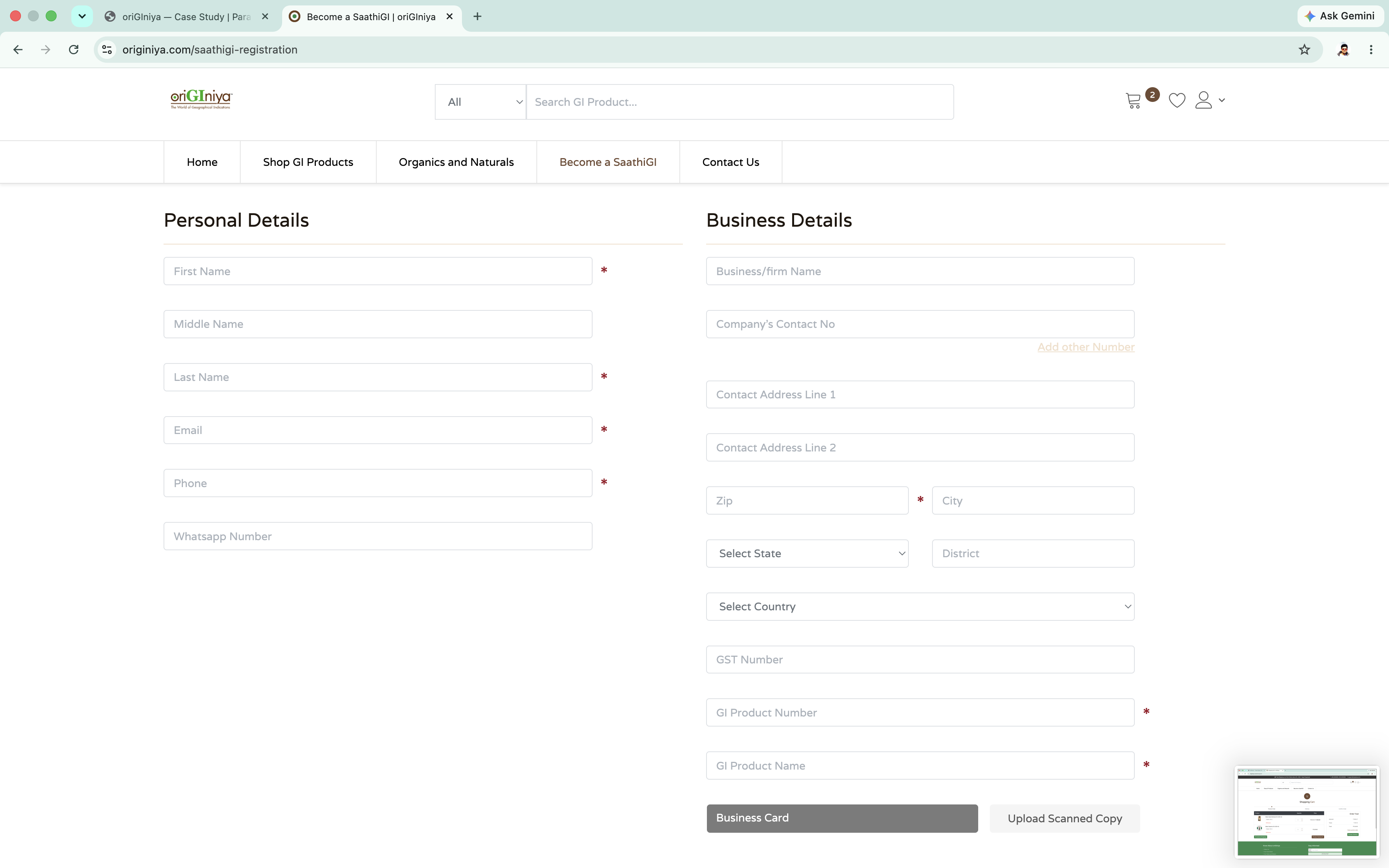 Become a SaathiGI
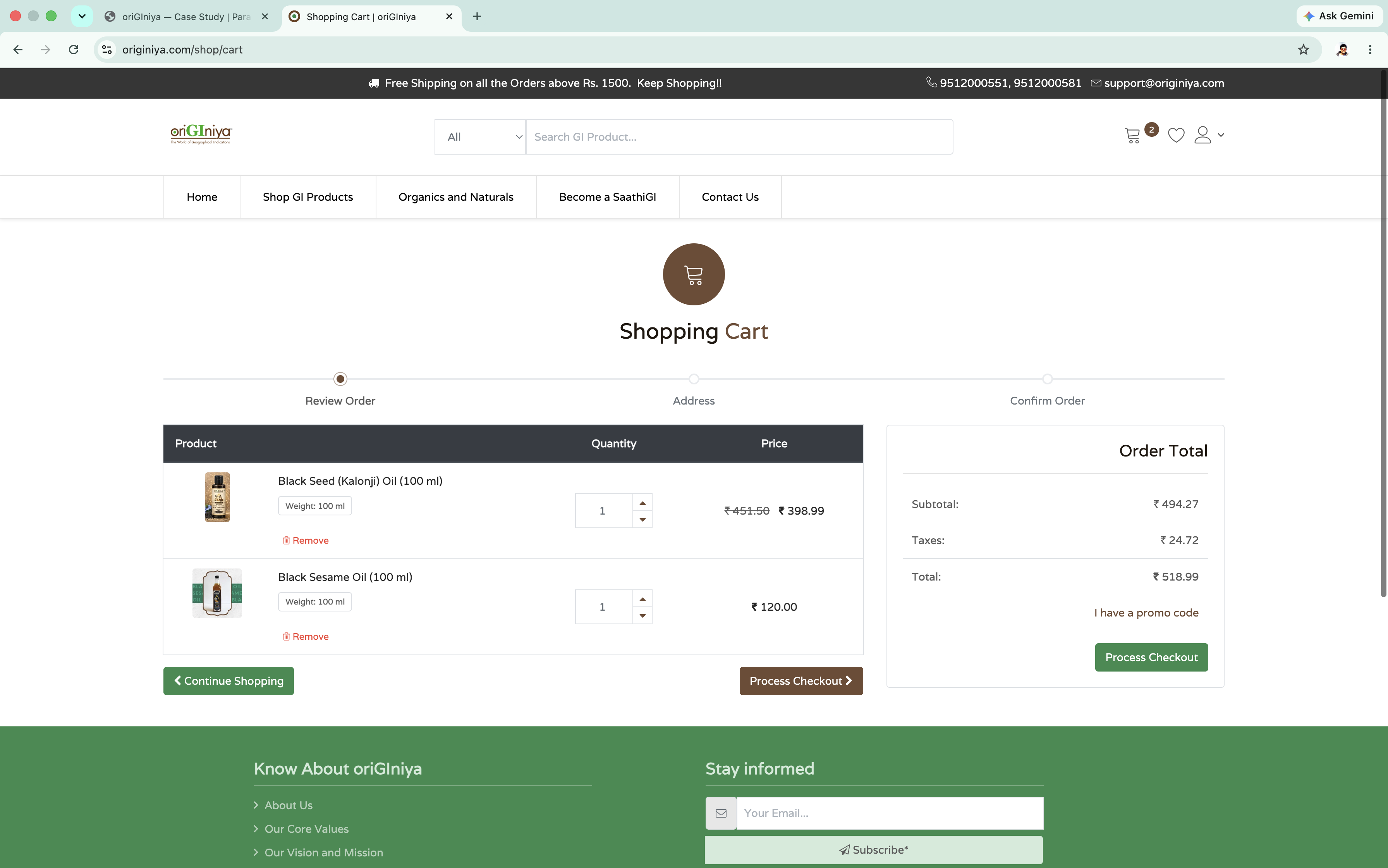 Cart / checkout
Authenticity front and center. Every product surfaces its GI registration number directly in the listing — a deliberate trust signal for a category (GI-tagged goods) most buyers won't recognize on sight.
Two audiences, one platform. The site serves buyers shopping and sellers (SaathiGI) onboarding at once.
Vision: Become the most trusted online marketplace for authentic GI-tagged products, building an ecosystem that empowers artisans from India's remotest regions.
Mission: Make authentic GI-tagged products accessible worldwide by simplifying artisan onboarding, product discovery, and purchase confidence — removing friction across the shopping journey through intuitive design and transparent information.
Customer acquisition is growing, but conversion and repeat purchases lag targets — shoppers face uncertainty during discovery and friction at checkout. On the seller side, artisan registration is long and unclear on eligibility/documents, driving high drop-off — which limits verified sellers joining the platform and raises manual support load.
Buyers: upper-middle-class and affluent consumers motivated by sustainability, regional/artisanal authenticity, corporate or festive gifting, and GI-certified collecting. Sellers: rural artisans, weavers, and farmers operating in regional GI clusters across India.
Authenticity confusion: buyers fear paying a premium for unverified regional goods.
Clearer GI certification display, seller origin stories, and video previews directly on product pages.
Checkout friction: hidden shipping fees, forced account creation, manual address entry, limited payment options.
Slide-out cart with upfront pricing, guest checkout, pincode-based address autofill, and 1-click UPI/wallet payment.
High-tech barrier: lengthy forms and document uploads are hard for rural sellers to complete.
Mobile-first registration with OTP verification and camera OCR to auto-scan certificates.
Language and literacy barriers exclude non-English-speaking artisans from onboarding.
Regional-language selection upfront, with voice-to-text input for product descriptions.
| Capability | GiTAGGED | oriGIniya (current) | Proposed target |
|---|---|---|---|
| GI registry search | Category only | Search by GI No. | Integrated GI lookup |
| Sourcing model | GI Panchayaths | SaathiGI Program | Direct cluster sourcing |
| Live inspection | WhatsApp preview | Not available | Live preview + video PDP |
| Login | Legacy forms | Legacy forms | 1-click mobile OTP |
| Language support | English only | English only | Regional dialect assist |
| Checkout | Multi-step form | Standard cart | Express UPI & guest cart |
Looking back with a few more years of UX experience, the biggest opportunity I'd lean into next is checkout and onboarding — the two areas where small friction points quietly add up. The original build got the fundamentals right: a clear storefront, working product discovery, and trust elements like GI certification already in place. The strategic audit I did later helped me see where those good foundations could go further — showing shipping and delivery estimates earlier in checkout, adding a guest checkout option, and making artisan registration lighter and more accessible with regional-language support for non-English-speaking sellers. It's less about fixing what was wrong and more about how a mature product keeps evolving — the same instincts that shaped the original build are what led me back to sharpen it.