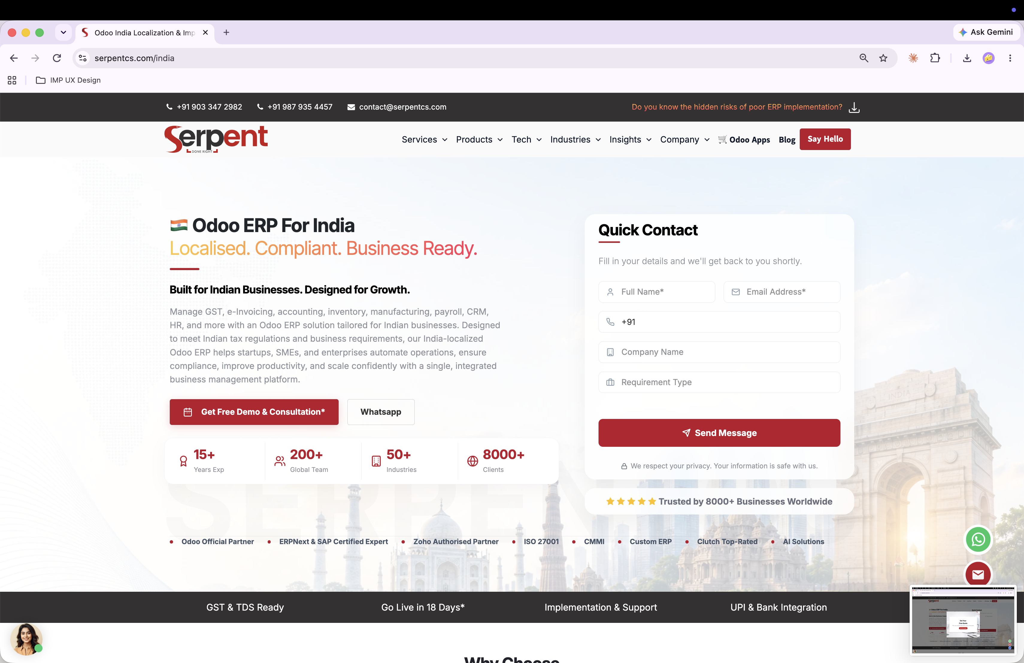
 + Add hero screenshot of the careers page here
A structured usability audit of the job-application flow, evaluated against Nielsen's 10 usability heuristics with severity-rated findings and recommendations.
+ Add hero screenshot of the careers page here
A heuristic evaluation is a fast, structured way to catch usability problems without recruiting test users — an expert walks a defined user journey against a known set of usability principles (Nielsen's 10 heuristics) and rates what they find by severity. It's a core method in a UX designer's toolkit, and this audit applies it to a real, live job-application flow.
The full flow a candidate follows from landing on the homepage through submitting a job application on the careers page.
A 24-year-old candidate with 2 years of Odoo development experience, actively looking to switch companies for a better opportunity.
Each heuristic was evaluated against the actual flow and scored on a 0–4 severity scale — 0 meaning no usability problem, 4 meaning a critical issue that should be fixed before release.
The homepage loads with no delay, but the careers page sits under the "Company" menu and again in the footer — not where a candidate expects to find it.
A user's entire purpose is applying for a job, but there's no easily visible link or highlighted button from the homepage itself.
Add a dedicated "Careers" link in the main menu, or place a small CTA banner before the footer.
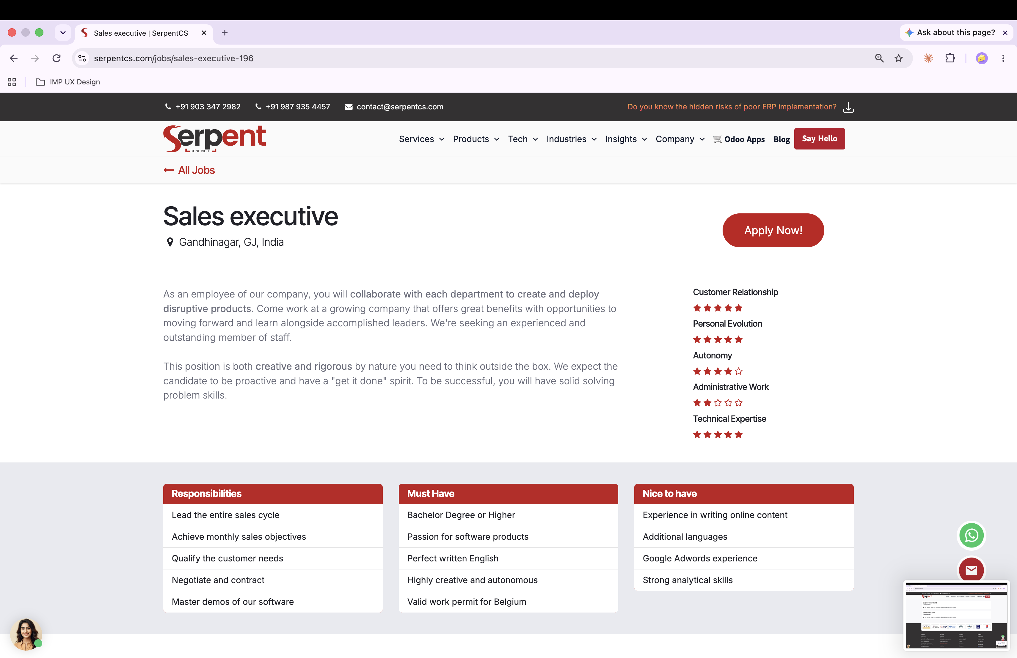
Clicking the careers link leads to a long page of company details, with an "Apply Now" button at the very end that doesn't easily catch the eye.
Users expect to see a list of open roles when they land on a careers page — instead they have to scroll through unrelated content first.
The flow is simple, but there's limited or no way to navigate backward without losing entered data — though with only a few fields, the impact is currently low.
Users shouldn't feel anxious about losing progress if they make a mistake partway through.
Add an option to save the application as a draft before submitting, and a confirmation step before final submission.
Branding and typography stay generally consistent through the flow, but the color of the "Apply Now" button changes between screens.
Consistent design lets users move through a flow with less cognitive load and helps them quickly identify the next action.
Standardize spacing, visual elements (like illustrations used), and CTA styling across the entire flow.
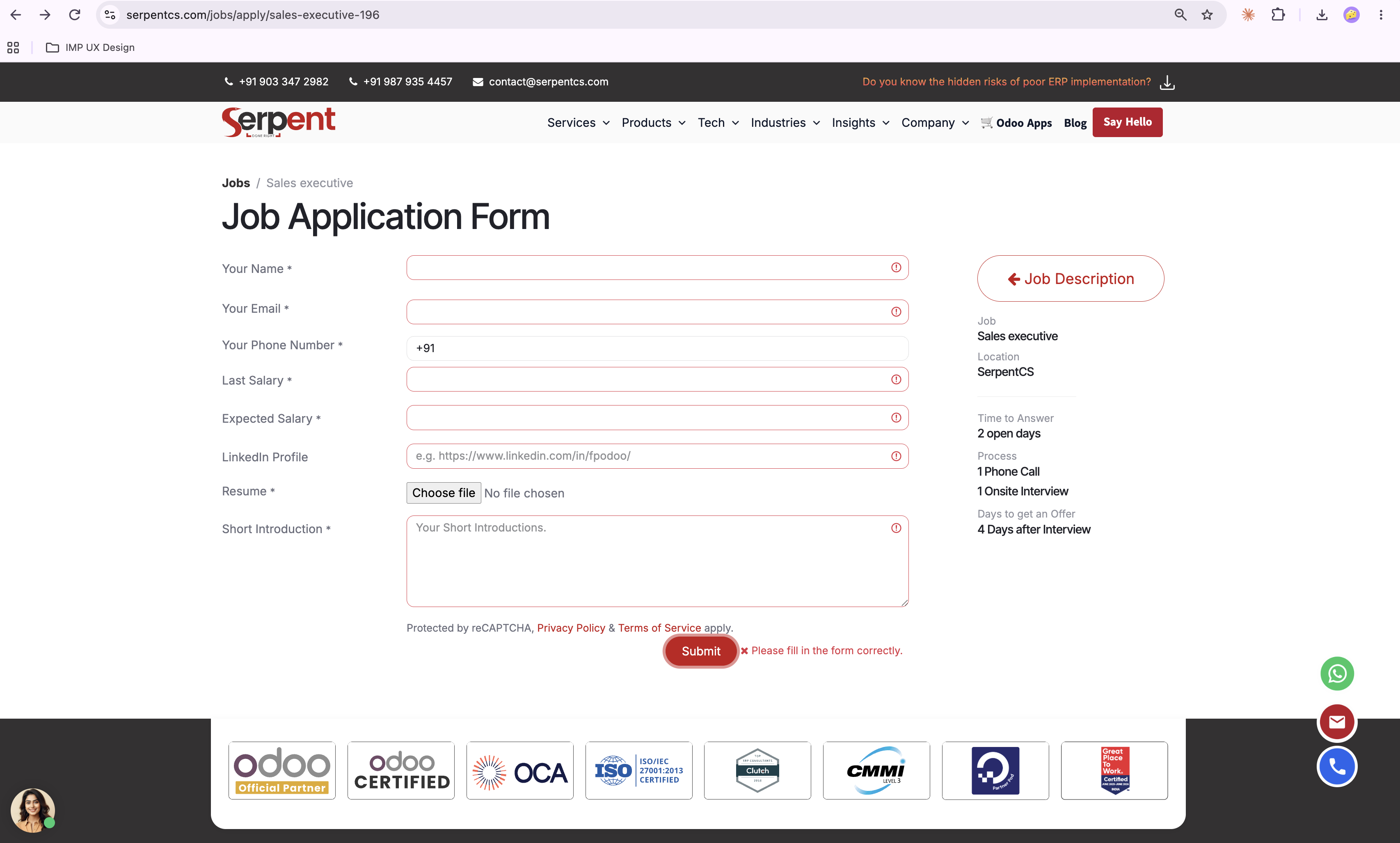
There's no prior information on which file types are accepted or the maximum file size when uploading a resume.
Clear upfront guidance prevents users from making a mistake and having to make multiple confused attempts.
Show a simple inline message stating the allowed file type and size. (Ref: Img No 10)
Each page provides relevant information, but users may need to remember job requirements or previously entered details when moving between the job description and the application form.
A good interface minimizes what users have to remember and gives them confidence to complete the task.
Display a summary of the selected job directly on the application page, with contextual guidance so users don't need to switch back and forth.
The flow itself is simple, but new users struggle to find where buttons are, and repeat users have to repeat the same monotonous clicks every time.
Reducing effort and time for a simple task matters — a lengthy, repetitive flow increases the chance of user drop-off.
Keep the path to the application form minimal — consider combining the job details and apply form into a single page.
The careers pages carry too much textual information overall, creating a lengthy page with repeated visual patterns and limited visual hierarchy — making it hard for users to quickly locate job opportunities.
Mixed visual patterns raise cognitive load, and frequent visitors are forced to re-scan the same information repeatedly.
Introduce clearer spacing, section dividers, and more concise content so users can scan the page efficiently.
In the application form, a text box turns red when required info is missing — but no message explains what's actually wrong.
Users get no information about what they're doing wrong and are forced to guess repeatedly before submitting correctly — the highest-severity issue found in this audit.
Show a proper inline message for every field, and use placeholder text with sample data where helpful. (Ref: Img No 9)
The final page clearly explains how the job application process works and confirms the job title and location — this part of the flow works well.
Easily accessible help lets users resolve questions without leaving the flow, improving satisfaction and trust.
A short FAQ or quick HR contact here would help the small number of candidates who need extra assistance — a minor enhancement, not a fix.
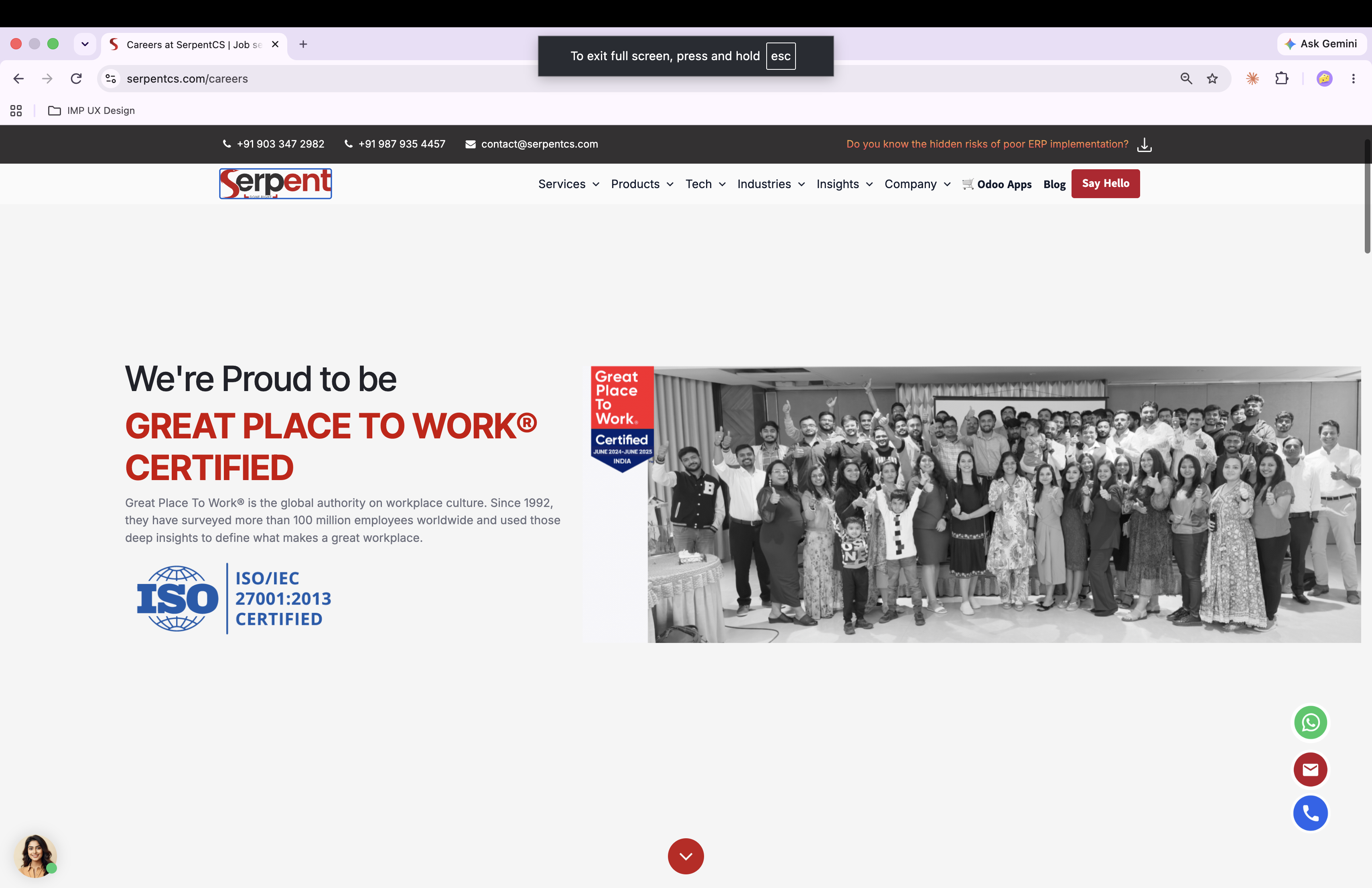 Homepage / nav
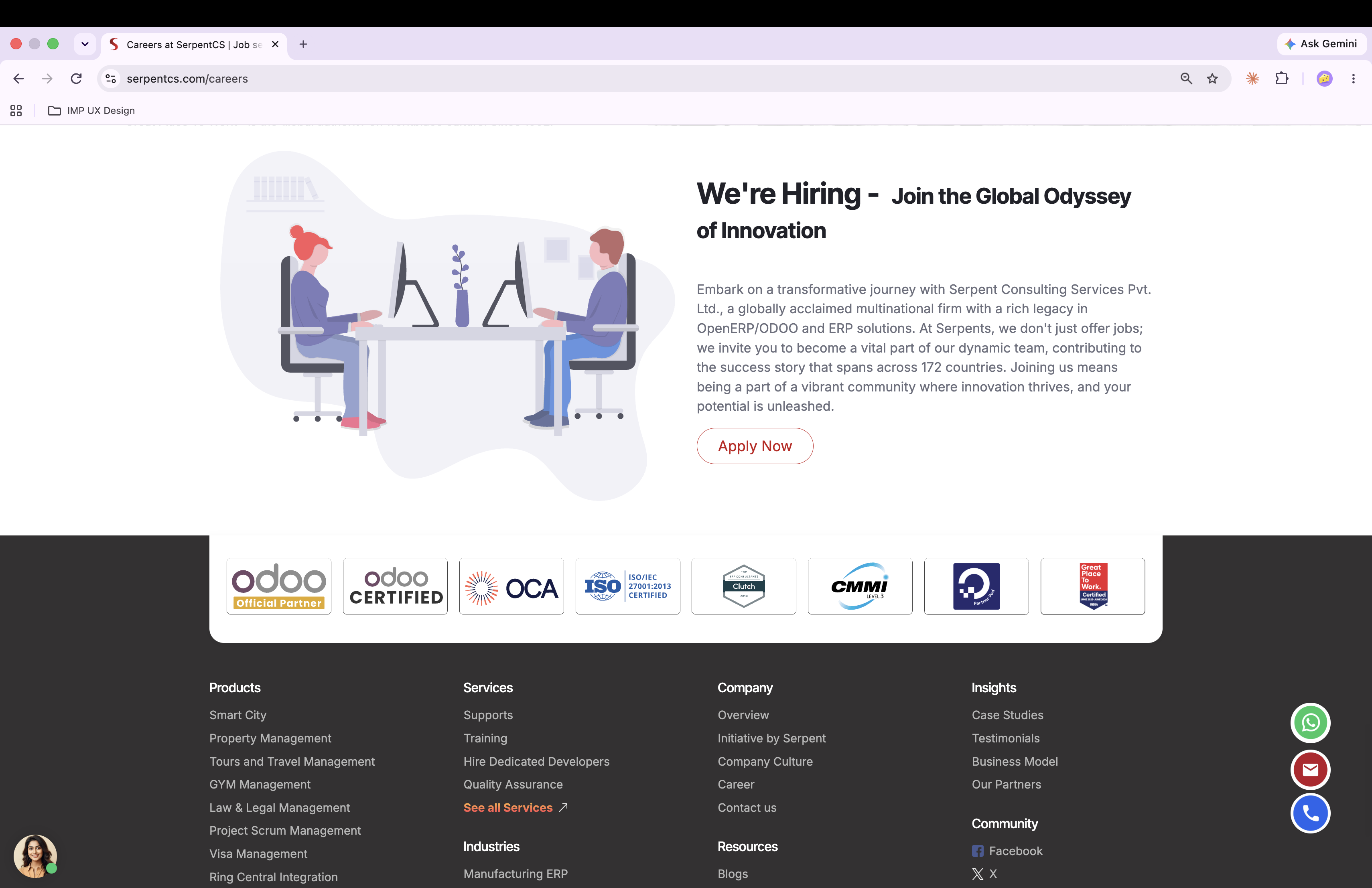 Careers landing page
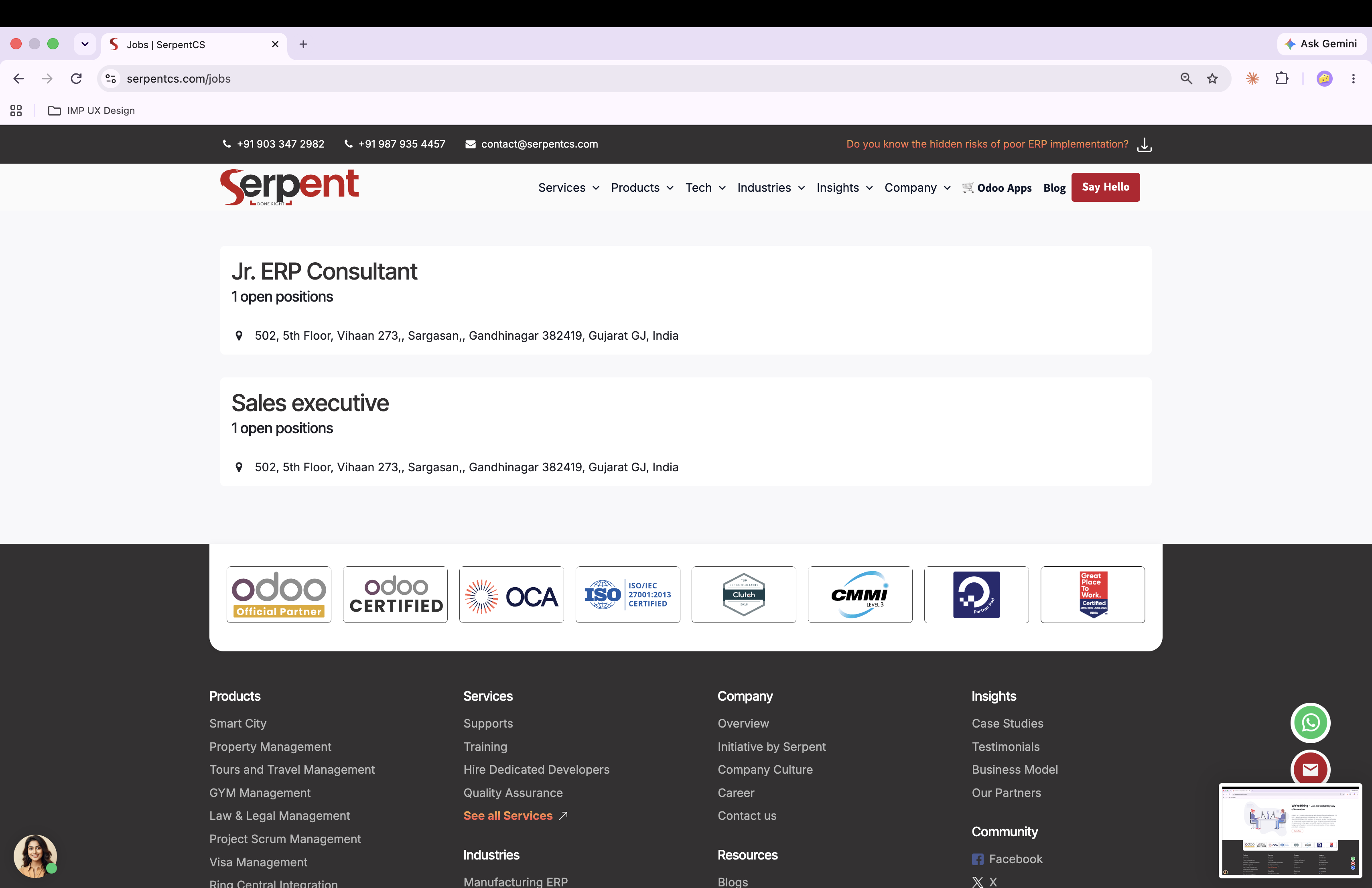 Job listing / description
 Application form (Img No 9)
 Confirmation page
As a self-initiated audit, this wasn't measured against live conversion metrics. Its value is the evaluation itself: a full pass against all 10 usability heuristics, a clear severity ranking that prioritizes what to fix first (the unlabeled validation errors, then file-upload guidance and page hierarchy), and concrete, actionable recommendations for each finding.
The natural next step is validating these findings with a small round of moderated usability testing — heuristic evaluation is fast and catches a lot, but watching a real candidate hit the unlabeled error fields or hesitate at the file upload step would confirm severity and sharpen the recommendations further. I'd also want to prioritize the fixes into a phased roadmap: the critical validation-messaging issue first, then the structural changes (page hierarchy, combining job details with the application form) that take more design and dev effort.