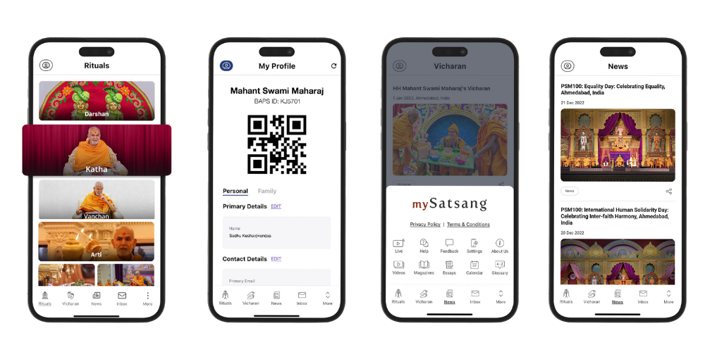
A self-initiated usability and accessibility audit of a real, live spiritual-content app, translating findings into a concrete visual and interaction redesign.
mySatsang is a real, published app used by BAPS followers to access spiritual content — daily rituals (Ahnik), talks and events (Vicharan), study material (Adhiveshan), and community features. At a glance it's a genuinely valuable tool, but the interface felt dated against current design standards, and given the organization's reputation for clarity and excellence, there was a clear gap between the brand's real-world standard and its digital one.
Assessed visual clarity, tone, and whether the interface matched the brand's real-world standard of excellence.
Checked whether entry points (Login, Signup, Guest Mode) and key functions were discoverable from the home screen.
Tested the full app on iPhone and iPad, in both portrait and landscape, to catch orientation-specific breakage.
Reviewed menu structure, typography hierarchy, and consistency of interaction patterns across sections.
In landscape orientation on iPad, some submenu items under the "More" menu became inaccessible — a real functional bug, not just a polish issue.
Rearrange the More menu, Settings submenus, and the Adhiveshan list to remain reachable in both orientations.
The home screen lists all available options, but presentation and placement made it harder than necessary to scan and act on.
Refine layout and grouping for clearer visual hierarchy without removing any existing functionality.
Guest-mode users see settings and options exclusively available to SSO-authenticated users, creating confusion and wasted interaction.
Hide or disable SSO-only options when the app is accessed via Guest login.
Font usage across the app lacked a consistent system, weakening hierarchy between titles and supporting text.
Standardize on two font roles — one for titles, one for body/supporting text — applied consistently app-wide.
The Adhiveshan section already lets users adjust font size and language — a genuinely good pattern that isn't available elsewhere in the app.
Extend that font-size and language control app-wide; apply WCAG-compliant color pairing throughout; consider a future screen-reader integration for visually impaired users.
Findings were translated into a concrete visual system rather than left as recommendations only.
| Element Type | AA | AAA |
|---|---|---|
| Small Text | Pass | Pass |
| Large Text | Pass | Pass |
| UI Components | Pass | Pass |
Contrast ratio 9.17:1 — well above the WCAG AA/AAA thresholds for both foreground (#731919) and background (#FAE6CD) pairing.
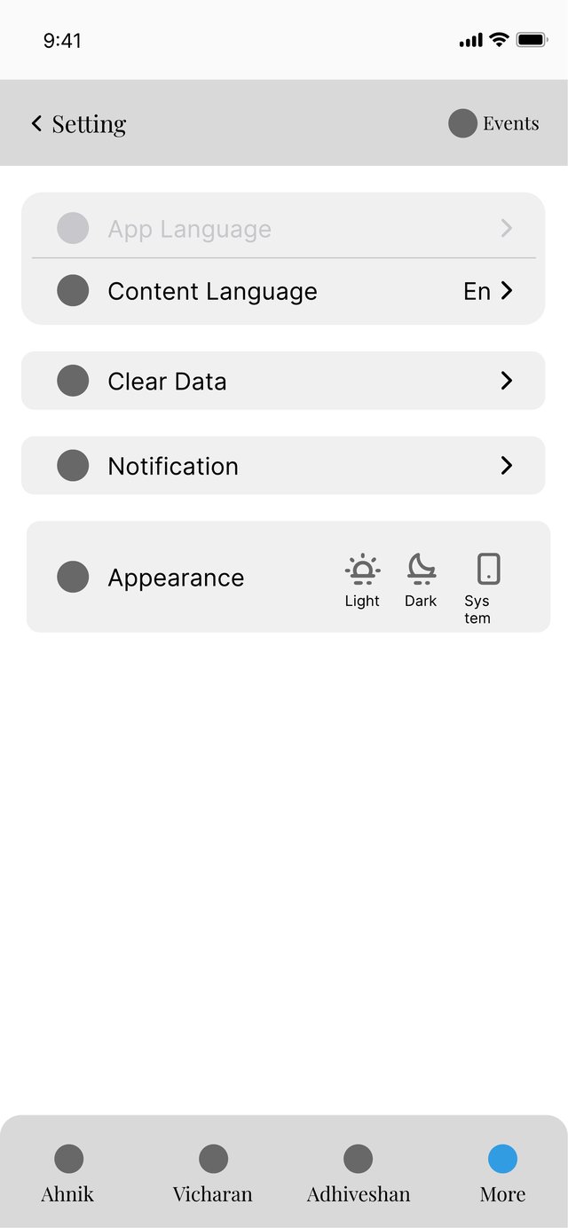
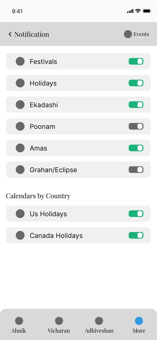
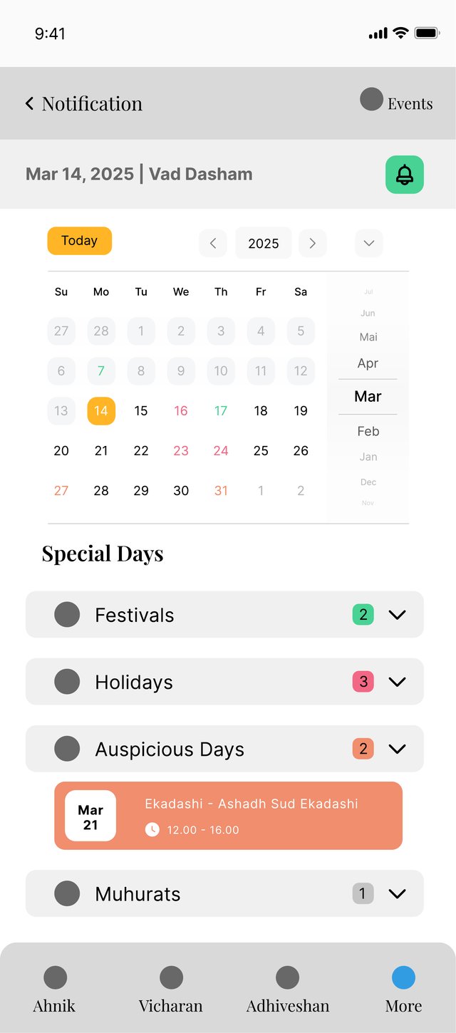
Key screens — Ahnik, Vicharan, Adhiveshan, Settings, Notifications, and Calendar — were reworked using the new palette, type system, and clarified hierarchy.
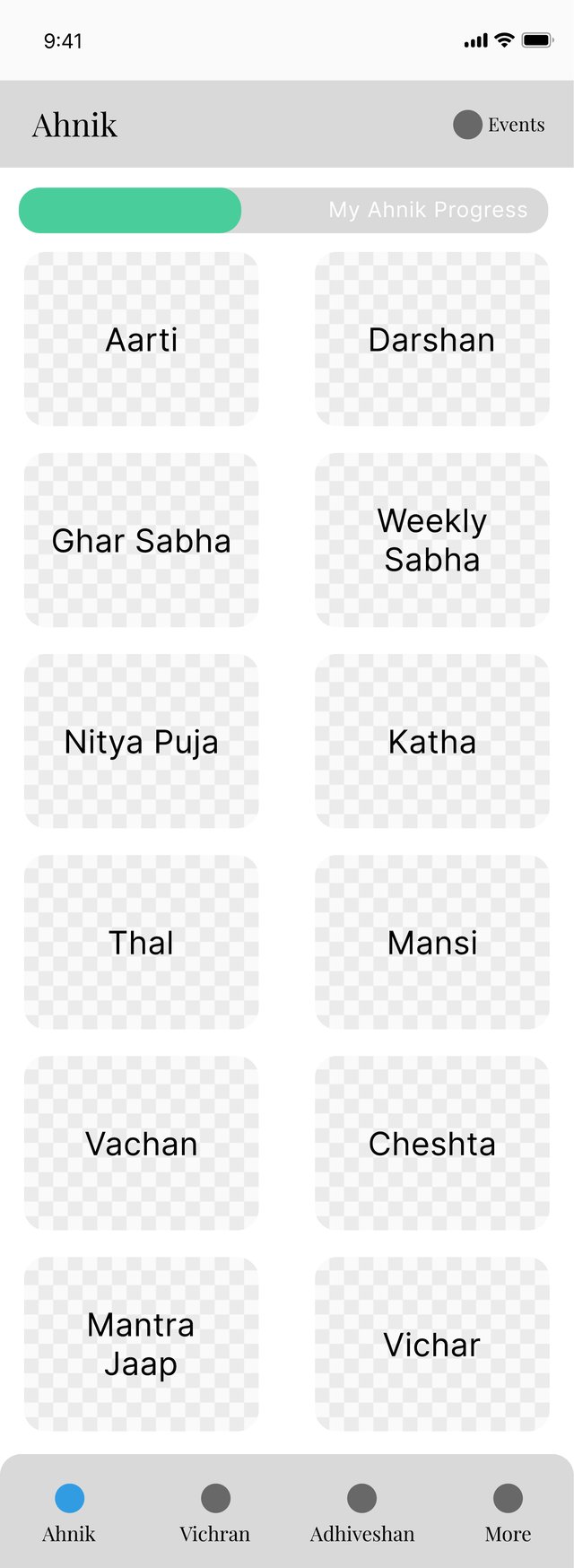
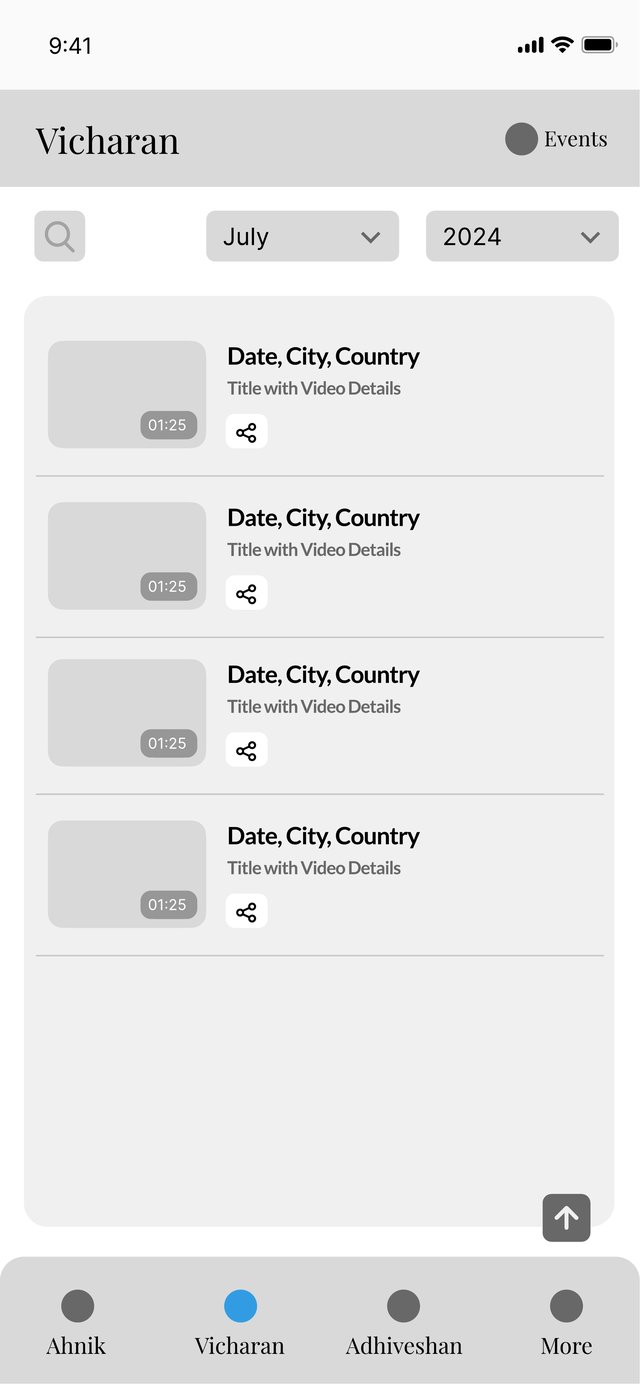
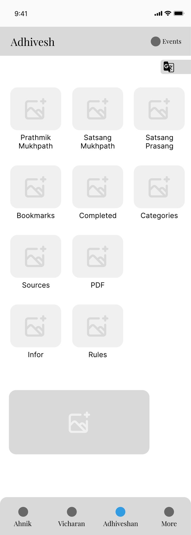
Since this was an independent audit, the next step would be to validate the redesign with real mySatsang users, particularly those who rely on assistive features. While the recommendations follow structured testing and WCAG standards, real-world usage can reveal gaps between design intent and usability. In the longer term, extending the existing language and font-size controls across the entire app could be the most impactful improvement.